Boxplots are a relatively simple way to show numerical data while providing the viewer key information about the range, median, and distribution of the data. I’m going to be creating boxplots to visualize the distributions of species that are statistically differentially abundant between groups. The statistics to determine the differentially abundant species were done using indicator species analysis which was explained in this tutorial.
First, we load in the data as before:
pc = read.csv("Your_OTU_table.csv", header= TRUE)
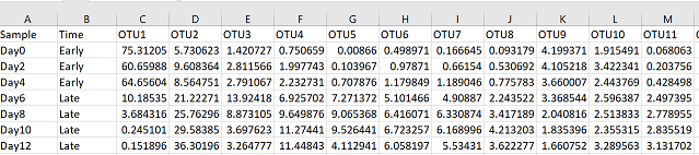
This table has the format of rows as samples and columns as OTUs/species.
Next, we subset the data as desired by calling the specific columns we want to include in our boxplot figure. I’ve chosen the top four most significant OTUs associated with the “Late” grouping, identified using the indicator species analysis test.
sub_pc = data.frame(Time = pc$Time, OTU15 = pc$OTU15, OTU11 = pc$OTU11, OTU26 = pc$OTU26, OTU6 = pc$OTU6)
Next, we load in the ggplot2 and reshape2 packages (for plotting and data manipulation respectively):
 library(ggplot2)
 library(reshape2)
Next, we convert the data frame from a “wide” format to a “long” format (See here for example of wide vs long data):
sub_pc_m = melt(sub_pc, id = "Time")
Now we can plot the data using geom_boxplot from ggplot2:
gg = ggplot(sub_pc_m, aes(x = variable, y = value, fill = Time)) +
     geom_boxplot(colour = "black", position = position_dodge(0.5)) +
     geom_vline(xintercept = c(1.5,2.5,3.5), colour = "grey85", size = 1.2) +
     theme(legend.title = element_text(size = 12, face = "bold"),
     legend.text = element_text(size = 10, face = "bold"), legend.position = "right",
     axis.text.x = element_text(face = "bold",colour = "black", size = 12),
     axis.text.y = element_text(face = "bold", size = 12, colour = "black"),
     axis.title.y = element_text(face = "bold", size = 14, colour = "black"),
     panel.background = element_blank(),
     panel.border = element_rect(fill = NA, colour = "black"),
     legend.key=element_blank()) +
     labs(x= "", y = "Relative Abundance (%)", fill = "Time") +
     scale_fill_manual(values = c("steelblue2", "steelblue4"))

gg
ggplot code can look a bit daunting because it requires many extra statements if you want to customize your figure. Try adding lines one at a time (everything before the ‘+’) to see how each parameter changes the plot.
Save using:
ggsave("Boxplot.svg")
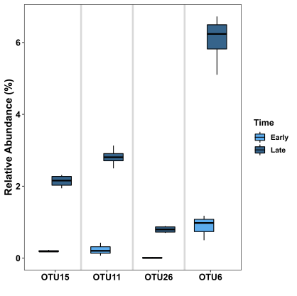
This figure shows 8 boxplots, 2 boxplots for each OTU. The boxplots in the light blue colour display the distribution of the abundance data for the corresponding OTU in the “Early” grouping, whereas the boxplots in the dark colour display the distribution of the abundance data for the corresponding OTU in the “Late” grouping. It’s obvious from this figure that for each OTU, the abundance is much higher in the “Late” grouping samples, which is consistent with the indicator species test.
A boxplot has a few main parts:
- The coloured box shows the median in the middle, and is bounded by the first and third quartiles (i.e. the 25th and 75th percentiles). The box makes up the area referred to as the Interquartile range or IQR
- The lines (or "whiskers") extending from the box represent the range of the data. Specifically, the upper line shows the maximum point that is no further than 1.5*IQR above the box's Q1, and the lower line shows the minimum point that is no further than 1.5*IQR below the box's Q3
- Any data not included within the range defined by the box and "whiskers" (i.e. plus/minus 1.5*IQR) is plotted as a dot, and is referred to as an "outlier". There are no outliers in this figure
For more tutorials on how to visualize your microbiome data in R, check out my tutorials on: Bubble plots, Stacked bar plots, and Correlation heatmaps