Bubble plots are another way to visualize compositional microbial community data (other than a stacked bar chart). In a bubble plot the relative abundance of a species in a sample is scaled to match the size of the corresponding point.
The initial data manipulation steps for this bubble plot are the same as for the stacked bar chart. Check out the stacked bar chart post for a more in-depth description of the initial steps, see below for the abridged version.
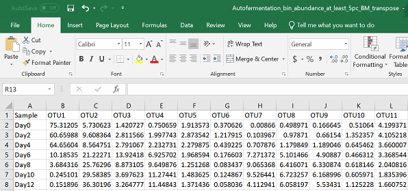
Start by setting your directory, uploading a csv file with species as columns and samples as rows, and loading the appropriate libraries.
#set your working directory by either setwd()
#or manually in R studio--> Session --> Set Working Directory --> Choose Directory
#upload your data to R - exchange "Your_csv_file.csv" with the name of your csv file
pc = read.csv("Your_csv_file.csv", header = TRUE)
library(ggplot2)
library(reshape2)
Change your data structure from a “wide” format to a “long” format. Put any variables that are not OTUs/species, into the “id” parameter
#convert data frame from a "wide" format to a "long" format
pcm = melt(pc, id = c("Sample"))
Pick your colours:
colours = c( "#A54657",  "#582630", "#F7EE7F", "#4DAA57","#F1A66A","#F26157", "#F9ECCC", "#679289", "#33658A",
"#F6AE2D","#86BBD8")
Keep the order of samples from your excel sheet:
pcm$Sample <- factor(pcm$Sample,levels=unique(pcm$Sample))
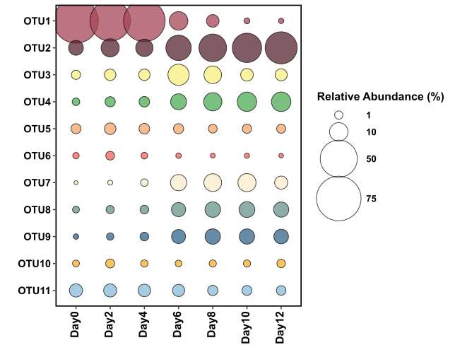
Plot it! For a bubble plot, you are using geom_point and scaling the size to your value (relative abundance) column.
xx = ggplot(pcm, aes(x = Sample, y = variable)) +
  geom_point(aes(size = value, fill = variable), alpha = 0.75, shape = 21) +
  scale_size_continuous(limits = c(0.000001, 100), range = c(1,17), breaks = c(1,10,50,75)) +
  labs( x= "", y = "", size = "Relative Abundance (%)", fill = "")  +
  theme(legend.key=element_blank(),
  axis.text.x = element_text(colour = "black", size = 12, face = "bold", angle = 90, vjust = 0.3, hjust = 1),
  axis.text.y = element_text(colour = "black", face = "bold", size = 11),
  legend.text = element_text(size = 10, face ="bold", colour ="black"),
  legend.title = element_text(size = 12, face = "bold"),
  panel.background = element_blank(), panel.border = element_rect(colour = "black", fill = NA, size = 1.2),
  legend.position = "right") +
  scale_fill_manual(values = colours, guide = FALSE) +
  scale_y_discrete(limits = rev(levels(pcm$variable)))

xx
Save it using ggsave
ggsave("Bubble_plot.svg")
The figure above uses the exact same data as the stacked bar chart figure, and you can decide for yourself which method of data representation you prefer. The real benefit of using bubble plots over stacked bar charts I believe, is when you have many more variables (OTUs/species) that you would like to display. In the below example I’m going to display ~40 OTUs on one figure and use another variable that describes the samples to colour the points.
#read in your file
pc = read.csv("Your_csv_file_larger.csv", header = TRUE)
You can see that I’ve added a column with a discrete variable called “Time”, with the options of either “early” or “late”. Discrete and continuous variables come up a lot in ggplot2 so it’s important to understand what they mean:
- Discrete: Data that can only take particular, distinct values. They can be numerical or they can be categorical.
- Examples: colours, years, apples or oranges, etc.
- Continuous: Data that can take any numerical values. Numbers that essentially can describe a range of values
- Examples: Temperature, height, length, relative abundance, etc
It gets a bit confusing because you can often determine if you would like to define a numerical variable (e.g. years) as discrete or continuous, particularly for the purposes of visualization, but I won’t get into that now. For our purposes the variable “Time” is Discrete
Now I will convert the “wide” format to a “long” format. This time because I have an extra variable that is not a species/OTU column, I include this name in the “id” bracket as well:
pcm = melt(pc, id = c("Sample", "Time"))
To keep sample order the same as the excel sheet:
pcm$Sample <- factor(pcm$Sample,levels=unique(pcm$Sample))
Now we plot it:
xx = ggplot(pcm, aes(x = Sample, y = variable)) +
      geom_point(aes(size = value, fill = Time), alpha = 0.75, shape = 21) +
       scale_size_continuous(limits = c(0.000001, 100), range = c(1,10), breaks = c(1,10,50,75)) +
       labs( x= "", y = "", size = "Relative Abundance (%)", fill = "Time")  +
       theme(legend.key=element_blank(),
       axis.text.x = element_text(colour = "black", size = 12, face = "bold", angle = 90, vjust = 0.3, hjust = 1),
       axis.text.y = element_text(colour = "black", face = "bold", size = 9),
       legend.text = element_text(size = 10, face ="bold", colour ="black"),
       legend.title = element_text(size = 11, face = "bold"), panel.background = element_blank(),
       panel.border = element_rect(colour = "black", fill = NA, size = 1.2),
       legend.position = "right", panel.grid.major.y = element_line(colour = "grey95")) +
       scale_fill_manual(values = c("darkorange", "skyblue"), guide = guide_legend(override.aes = list(size=5))) +
       scale_y_discrete(limits = rev(levels(pcm$variable)))
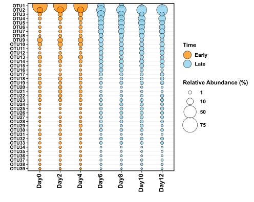
You can see that this time I am colouring the dots based on whether the sample was “early” or “late”, which is more reasonable than giving each of the 40 OTUs their own colour.
Again, save with ggsave:
ggsave("Bubble_plot_larger.svg")