Correlation is defined broadly in statistics as any association between two variables. Fundamentally, correlation does not equal causation, but finding two variables that are statistically correlated can be helpful in developing predictions about the relationships in your data.
In microbial ecology, I find that using correlation analyses to determine which species/OTUs are correlated (positively or negatively) in abundance with which other species/OTUs, is a quick and easy way to gain insights into how the microbial community is assembled broadly, and also helps to find more intricate relationships between specific species. Alternatively, if you have numerical, environmental variables of interest (i.e. temperature, organic acid concentration, depth, etc), you can also test to see which OTUs are correlated with which variables. Correlations with these variables can give you insight into niche differentiation and metabolism.
There can be hundreds of OTUs in microbial ecology data, which would make the process of testing for correlations between each possible OTU pairing very tedious. Instead of doing these analyses one at a time, you can use R to generate correlation matrices, which calculate the pairwise correlation coefficients between your OTUs. This correlation matrix can then be plotted in heatmap form for an easy visualization.
Below I will show you how to generate a correlation matrix with your OTU data, and then how to plot that matrix as a heatmap using the R packages corrplot, and ggplot2.
First, install and load the appropriate packages:
install.packages("corrplot")
library(corrplot)
install.packages("ggplot2")
library(ggplot2)
Next, read in your data as before:
pc = read.csv("Your_OTU_table.csv", header = TRUE)
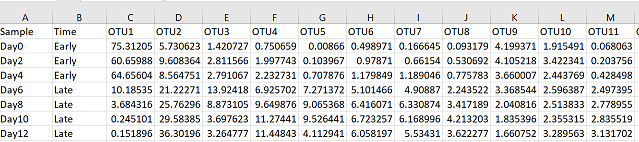
Create a data frame with only your abundance data. In my case, the first two columns are sample names and groups, so my abundance data starts in column 3. You may have hundreds of OTUs, but I recommend subsetting your data so that you are including no more than 50 OTUs at a time in your analysis, otherwise it’s hard to look at
#define the columns that contain your abundance data. Change the number after the ":" to subset your data
com = pc[,3:52]
Now create a correlation matrix with your community composition data using the command ‘cor’:
cc = cor(com, method = "spearman")

###if you have missing values in your data add the 'use' parameter. Check '?cor' for the cor command help page
Now you have a correlation matrix that contains correlation coefficients for every pairwise combination of OTUs in your data. The command is fairly straightforward, but you do have one statistical decision to make in deciding the method that is used to calculate the correlation coefficients. You can decide between Pearson, Spearman, and Kendall coefficients, but I generally choose either Pearson or Spearman:
- Pearson correlation: is the linear correlation between two variables.
- Spearman correlation: is a non-parametric measure of rank correlation and assesses how well a relationship between two variables can be described using a monotonic function. A monotonic function is just a fancy way of describing a relationship where for each increasing x value, the y value also increases.
I usually use Spearman correlation because I’m not overly concerned that my relationships fit a linear model, and Spearman captures all types of positive or negative relationships (i.e. exponential, logarithmic). This wikipedia page provides some visual examples of the differences between Spearman and Pearson correlation.
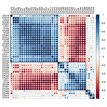
The easiest way to visualize this correlation matrix is using the function “corrplot” from the package corrplot:
corrplot(cc)
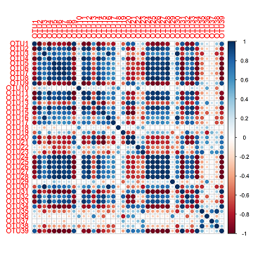
This produces quite a nice figure already. Along each axis are your OTUs and the colours where two OTUs meet is the correlation between those OTUs. In this figure, blue is positive and red is negative. The diagonal line of dark blue cutting across the square is due to the perfect correlation between an OTU and itself.
I don’t particularly like the font size or colour so I will change these parameters with ‘tl.cex’, and ‘tl.col’. I also would like to cluster my OTUs so that those with similar patterns of correlation coefficients are closer together. I can do this by defining the ‘order’ parameter with “hclust” (for heirarchical clustering), and the ‘hclust.method’ as “average”. I can also add rectangles with ‘addrect’ which will divide the OTUs into a given number of groups based on heirarchical clustering.
corrplot(cc, tl.col = "black", order = "hclust", hclust.method = "average", addrect = 4, tl.cex = 0.7)
Save this plot using:
png(filename = "corrplot.png", width = 6, height = 6, units = "in", res = 400)
corrplot(cc, tl.col = "black", order = "hclust", hclust.method = "average", addrect = 4, tl.cex = 0.7)
dev.off()
The plots generated with corrplot are easy to make and create very nice figures. However, they are difficult to customize, so if you’re looking for more control over your figures I would suggest using ggplot2. Below is the code to make a heatmap with correlation data using ggplot2.
You need to manipulate the correlation matrix a bit to get it in the proper format for ggplot:
- Change the matrix into a data frame format
- Make the row names of your data frame into a column in your new data frame
- Load in the package reshape2 for data manipulation
- Finally, convert your "wide" format data frame into a "long" format data frame
cc_df = as.data.frame(cc)
cc_df$OTUs = row.names(cc_df)
library(reshape2)
ccm = melt(cc_df, id = "OTUs")
To keep OTU order the same as the initial excel sheet:
ccm$OTUs <- factor(ccm$OTUs,levels=unique(ccm$OTUs))
Plotting in ggplot:
xx = ggplot(ccm, aes(x = variable, y = OTUs)) +
    geom_tile(aes(fill = value), colour = "grey45") +
    coord_equal() +
    scale_fill_gradient(low = "navy", high = "darkorange") +
    theme(axis.text.y = element_text(face = "bold", colour = "grey25"),
    legend.title = element_text(size = 10, face = "bold"),legend.position = "bottom",
    axis.text.x = element_text(angle = 90, face = "bold",colour = "grey25", vjust = 0.5, hjust = 0),
    panel.background = element_blank(), panel.border = element_rect(fill = NA, colour = NA),
    axis.ticks = element_blank()) +
    labs(x= "", y = "", fill = "Spearman's Correlation") +
    scale_x_discrete(position = "top") +
    scale_y_discrete(limits = rev(levels(ccm$OTUs)))
xx
Save with ggsave:
ggsave("Correlation_heatmap.svg")