A non-metric multidimensional scaling (NMDS) plot is one of the many types of ordination plots that can be used to show multidimensional data in 2 dimensions. An NMDS plot basically highlights the similarities between samples of complex multidimensional data. The closer two points (samples) are on the plot the more similar those samples are in terms of the underlying data. In my case, I’m usually looking at species abundance of microorganisms across samples. So the closer two samples are to each other, the more similar they are in terms of their microbial communities.
The approach to generate an NMDS plot is non-metric, meaning that the algorithm doesn’t assume any particular distribution of the data, which is handy when you have data that is inherently weird, and doesn’t conform to a bell-curve style distribution. The algorithm uses a rank based approach, that essentially ranks your samples in terms of closeness to one another based on a particular distance metric (i.e. Bray Curtis) and plots these relationships in 2 dimensional space. More about the specifics of the methods here. While this is a robust method for non-conforming data, it means that within an NMDS ordination plot the axes and coordinate system are arbitrary and don’t directly relate to any meaningful values.
An important note: An NMDS is just a visualization technique, and is not a statistical assessment of sample separation or correlation. For this you should run a statistical test, like an ANOSIM test for categorical variables, or a Mantel test for continuous variables. Other ordination techniques like PCA, CA, CCA, RDA, etc, may be more useful to you if you want your axes to be meaningful, or if you want to talk about variation partitioning.
Okay, all that being said. There are ways to overlay extra information on your NMDS plots to help visualize the underlying trends that are affecting your data. In my case, the underlying environmental variables that are covarying with microbial community structure, and thus potentially driving changes in the community. A series of functions from the R package vegan are meant to overlay extra information on ordination plots like NMDS plots. These functions include envfit, ordiplot, ordiellipse and ordisurf. I will start by explaining how to use the features of envfit here.
ENVFIT
Envfit fits environmental vectors or factors onto an ordination. The default plot for envfit, like metaMDS, isn’t very aesthetically pleasing, so I will show how you can plot both using ggplot2.
First load your libraries and read in your data:
library(vegan)
library(ggplot2)
df = read.csv("your_data_frame.csv", header = TRUE)
My data contains samples as rows and columns contain either environmental variables, or species abundance data. In this example, I have both categorical and continuous environmental variables.
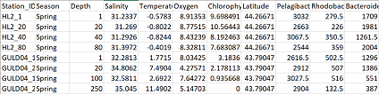
Next, subset your data so that you have a data frame with only environmental variables (env), and a data frame with only species abundance data (com). In the code below I’m naming the range of columns in my data containing the respective information.
com = df[,9:32]
env = df[,2:8]
Perform the NMDS ordination, as discussed more in this tutorial
#convert com to a matrix
m_com = as.matrix(com)

#nmds code
set.seed(123)
nmds = metaMDS(m_com, distance = "bray")
nmds
Now we run the envfit function with our environmental data frame, env.
en = envfit(nmds, env, permutations = 999, na.rm = TRUE)
The first parameter is the metaMDS object from the NMDS ordination we just performed. Next is env, our environmental data frame. Then we state we want 999 permutations, and to remove any rows with missing data.
Let’s see what the envfit function returns:
 en

***VECTORS

               NMDS1    NMDS2     r2 Pr(>r)
Depth        0.32513 -0.94567 0.7954  0.001 ***
Salinity     0.69000 -0.72381 0.5023  0.001 ***
Temperature  0.75734  0.65303 0.7817  0.001 ***
Oxygen      -0.91051  0.41349 0.7738  0.001 ***
Chlorophyll -0.99684 -0.07940 0.4881  0.001 ***
Latitude    -0.95483 -0.29715 0.1051  0.001 ***
---
Signif. codes:  0 ‘***’ 0.001 ‘**’ 0.01 ‘*’ 0.05 ‘.’ 0.1 ‘ ’ 1
Permutation: free
Number of permutations: 999

***FACTORS:

Centroids:
               NMDS1   NMDS2
SeasonFall    0.2016  0.0592
SeasonSpring -0.1741 -0.0511

Goodness of fit:
           r2 Pr(>r)
Season 0.4163  0.001 ***
---
Signif. codes:  0 ‘***’ 0.001 ‘**’ 0.01 ‘*’ 0.05 ‘.’ 0.1 ‘ ’ 1
Permutation: free
Number of permutations: 999
When we call the results of the envfit function, we get results that are split into Vectors and Factors, for your continuous and categorical variables respectively. If your data does not include both, then you will see only either vectors or factors. For both vectors and factors, a table is shown that gives the variables as rows, and then gives their respective coordinates on the NMDS ordination in the NMDS1 and NMDS2 axes. If permutations > 0, the significance of fitted vectors or factors is assessed using permutation of environmental variables.
An explanation from the envfit description: “The printed output of continuous variables (vectors) gives the direction cosines which are the coordinates of the heads of unit length vectors. In plot these are scaled by their correlation (square root of the column r2) so that “weak” predictors have shorter arrows than “strong” predictors… …Function vectorfit finds directions in the ordination space towards which the environmental vectors change most rapidly and to which they have maximal correlations with the ordination configuration. Function factorfit finds averages of ordination scores for factor levels.”
The way I interpret this is that the vectors act as a kind of “pseudo axis” within your plot. If you travel along your plot in that direction, you will see that your samples generally increase with respect to that variable. This of course is not a perfect relationship, which is where the r2 and signficance values come in to explain the strength of the association. Longer arrows, mean a stronger association. Because this relationship isn’t always linear, the developers of envfit suggest that you could also use alternate methods to map important variables onto your data including point size or the ordisurf function.
The centroid value for all the samples belonging to a certain category are plotted by the factor coordinates, which allows you to see how well samples from specific categories are grouping together (or not).
We can plot both our NMDS and the envfit results using base R to see how the factors and vectors are plotted:
plot(nmds)
plot(en)
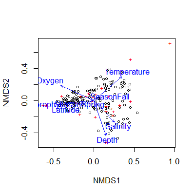
The envfit vectors and factors (blue) are overlaid on the original NMDS plot with samples as black points. The base R plot here is really difficult to read, easily overcrowded, and difficult to customize. I recommend using ggplot2 to make nicer looking plots.
In order to plot using ggplot2, you need to extract the appropriate information from the nmds and envfit results.
For the NMDS output, use the following code to extract the sample coordinates in the NMDS ordination space. Then add columns from your original data that contain information that you would like to include in your plot. In this case I’m including the column “season”
data.scores = as.data.frame(scores(nmds))
data.scores$season = df$Season
The newest version of the vegan package (>2.6-2) changed the format of the scores(nmds) object to a list, and so the above code will throw an error saying arguments imply differing number of rows. If you get this error try the following code instead to extract your site scores:
#extract NMDS scores (x and y coordinates) for sites from newer versions of vegan package
data.scores = as.data.frame(scores(nmds)$sites)

#add 'season' column as before
data.scores$season = df$Season
Extracting the required information from the envfit result is a bit more complicated. The envfit output contains information on the length of the segments for each variable. The segments are scaled to the r2 value, so that the environmental variables with a longer segment are more strongly correlated with the data than those with a shorter segment. You can extract this information with scores. Then these lengths are further scaled to fit the plot. This is done with a multiplier that is analysis specific, and can be accessed using the command ordiArrowMul(en). Below I multiply the scores by this multiplier to keep the coordinates in the correct proportion.
Because my data contained continuous and categorical environmental variables, I’m extracting the information from both separately using the “vectors” and “factors” options respectively.
en_coord_cont = as.data.frame(scores(en, "vectors")) * ordiArrowMul(en)
en_coord_cat = as.data.frame(scores(en, "factors")) * ordiArrowMul(en)
Now the data is in the appropriate format to plot in R using ggplot2.
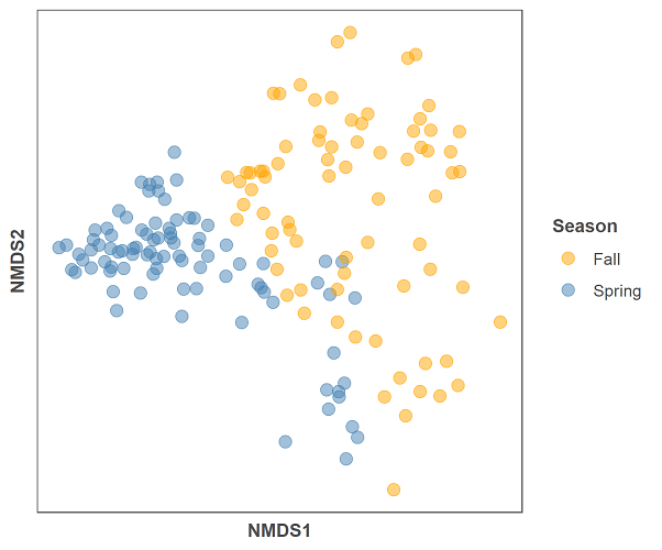
First we will make a figure of just the nmds plot without the envfit variables:
gg = ggplot(data = data.scores, aes(x = NMDS1, y = NMDS2)) +
     geom_point(data = data.scores, aes(colour = season), size = 3, alpha = 0.5) +
     scale_colour_manual(values = c("orange", "steelblue")) +
     theme(axis.title = element_text(size = 10, face = "bold", colour = "grey30"),
     panel.background = element_blank(), panel.border = element_rect(fill = NA, colour = "grey30"),
     axis.ticks = element_blank(), axis.text = element_blank(), legend.key = element_blank(),
     legend.title = element_text(size = 10, face = "bold", colour = "grey30"),
     legend.text = element_text(size = 9, colour = "grey30")) +
     labs(colour = "Season")

gg
And below is the code for the NMDS plot and the envfit data:
gg = ggplot(data = data.scores, aes(x = NMDS1, y = NMDS2)) +
     geom_point(data = data.scores, aes(colour = season), size = 3, alpha = 0.5) +
     scale_colour_manual(values = c("orange", "steelblue"))  +
     geom_segment(aes(x = 0, y = 0, xend = NMDS1, yend = NMDS2),
       data = en_coord_cont, size =1, alpha = 0.5, colour = "grey30") +
     geom_point(data = en_coord_cat, aes(x = NMDS1, y = NMDS2),
       shape = "diamond", size = 4, alpha = 0.6, colour = "navy") +
     geom_text(data = en_coord_cat, aes(x = NMDS1, y = NMDS2+0.04),
       label = row.names(en_coord_cat), colour = "navy", fontface = "bold") +
     geom_text(data = en_coord_cont, aes(x = NMDS1, y = NMDS2), colour = "grey30",
       fontface = "bold", label = row.names(en_coord_cont)) +
     theme(axis.title = element_text(size = 10, face = "bold", colour = "grey30"),
       panel.background = element_blank(), panel.border = element_rect(fill = NA, colour = "grey30"),
       axis.ticks = element_blank(), axis.text = element_blank(), legend.key = element_blank(),
       legend.title = element_text(size = 10, face = "bold", colour = "grey30"),
       legend.text = element_text(size = 9, colour = "grey30")) +
     labs(colour = "Season")

gg
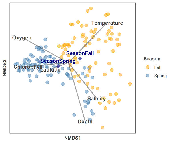
The plot is a bit busy still, but looks much nicer than the original base R example. The code is a bit more complicated because there are now many aspects to the plot including points, line segments, and text labels. The main difference between this plot and others in this tutorial series, is that we are drawing information from 3 different data frames here, and thus must specify the data source each time we add a geom layer to the plot.
Try adding each block of code before the “+” one at a time in order to get a better undertanding of what each layer is adding to the plot.