Non-metric Multi-dimensional Scaling (NMDS) is a way to condense information from multidimensional data (multiple variables/species/OTUs), into a 2D representation or ordination. In this ordination, the closer two points are, the more similar the corresponding samples are with respect to the variables that went into making the NMDS plot.
NMDS plots are great tools for microbial ecologists (and others working with big data) because you can condense the overwhelming amount of information from the distribution of multiple species/OTUs across your samples into something you can actually look at. In an NMDS plot generated using an OTU table the points are samples. The closer the points/samples are together in the ordination space, the more similar their microbial communities.
I’m in no way a statistical expert, but I will briefly try to give an overview of how the NMDS plot is generated. If you want to learn more, check out the GUSTAME page dedicated to explaining NMDS.
NMDS plots are non-metric, meaning that among other things, they use data that is not required to fit a normal distribution. This is handy for microbial ecologists because the majority of our data has a skewed distribution with a long tail. In other words, there are only a few abundant species, and many, many species with low abundance (the long tail).
NMDS is an iterative algorithm, so it repeats the same series of steps over and over again until it finds the best solution. This is important to note because it means that each time you produce an NMDS plot from scratch it may look slightly different, even when starting with exactly the same data.
What makes an NMDS plot non-metric is that it is rank-based. This means that instead of using the actual values to calculate distances, it uses ranks. So for example, instead of saying that sample A is 5 points away from sample B, and 10 from sample C, you would instead say that: sample A is the “1st” most close sample to B, and sample C is the “2nd” most close.
The last basic thing to know about NMDS is that it uses a distance matrix as an input. Read more about distance measures here. There are many different distance measures to choose from, however as a default, I tend to use Bray-Curtis when dealing with relative abundance data. Bray-Curtis takes into account species presence/absence, as well as abundance, whereas other measures (like Jaccard) only take into account presence/absence.
Okay now to make one: Read in your OTU table that has species/OTUs as columns, and samples as rows, and install or load the package vegan into R. If you want to include a descriptor column(s) for your samples, it’s easiest to place them next to the first column with all your sample names.
install.packages("vegan")
library(vegan)
pc = read.csv("Your_OTU_table.csv", header= TRUE)
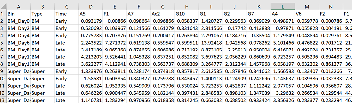
Now you want to make a data frame that only includes your species/OTU abundance columns. In my case, my column 1 is sample names, my column 2 is the type of sample, and my column 3 is a treatment variable. Therefore my abundance data goes from my 4th column, until the end.
#make community matrix - extract columns with abundance information
com = pc[,4:ncol(pc)]
Often in R you will get errors because your data is not in the right format. Right now our data is in the “data frame” format, but it needs to be in the “matrix” format for use in the vegan package. The following code is how to convert it:
#turn abundance data frame into a matrix
m_com = as.matrix(com)
Now we can run the metaMDS command from the vegan package to generate an NMDS plot. I usually keep most of the parameters default, and I add “bray” as the distance measure. Here is the R documentation for the metaMDS command if you wanted to change any of the default parameters. Include the set.seed command before the metaMDS command in order to obtain the same results each time you run your nmds plot with your dataset.
set.seed(123)
nmds = metaMDS(m_com, distance = "bray")
nmds
Calling your nmds object in R, will give you some information about your analysis. An important number to note is the stress, which is roughly the “goodness of fit” of your NMDS ordination. For a good representation of your data, the stress value should ideally be less than 0.2. If the stress value is 0, it might mean you have an outlier sample that is very different than all your other samples. Depending on your question, you may want to remove this sample to observe any other underlying patterns in your data. The stress value should be reported somewhere in your figure or figure caption. My stress value for this analysis is 0.03.
You can easily plot your NMDS in base R:
plot(nmds)
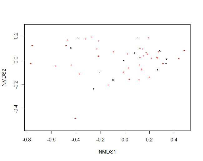
But as you can see, the plot can get very crowded and doesn’t give you any information about the samples (circles), or species (stars). For this reason, I often export the data I need from my nmds object so that I can plot the figure in a nicer way using ggplot2.
So to do this, first you need to obtain the coordinates for your NMDS1 and NMDS2 axes and put them in a new data frame: I’ve called this new data frame, “data.scores”:
#extract NMDS scores (x and y coordinates)
data.scores = as.data.frame(scores(nmds))
The newest version of the vegan package (>2.6-2) changed the format of the scores(nmds) object to a list, and so the above code will throw an error saying arguments imply differing number of rows. If you get this error try the following code instead to extract your site scores:
#extract NMDS scores (x and y coordinates) for sites from newer versions of vegan package
data.scores = as.data.frame(scores(nmds)$sites)
Next, you can add columns from your original data (pc) to your new NMDS coordinates data frame. This will come in handy when you plot your data and want to differentiate groups or treatments:
#add columns to data frame
data.scores$Sample = pc$Sample
data.scores$Time = pc$Time
data.scores$Type = pc$Type

head(data.scores)
You can add as little or as many columns as you want to your new NMDS data frame, and you can change the names of the variables (the part after the $) to what is meaningful for your data. The “head” command at the end will show you the first 5 rows of your new data frame (just for your own reference).
Now we can plot our NMDS in ggplot2
library(ggplot2)

xx = ggplot(data.scores, aes(x = NMDS1, y = NMDS2)) +
  geom_point(size = 4, aes( shape = Type, colour = Time)) +
  theme(axis.text.y = element_text(colour = "black", size = 12, face = "bold"),
        axis.text.x = element_text(colour = "black", face = "bold", size = 12),
        legend.text = element_text(size = 12, face ="bold", colour ="black"),
        legend.position = "right", axis.title.y = element_text(face = "bold", size = 14),
        axis.title.x = element_text(face = "bold", size = 14, colour = "black"),
        legend.title = element_text(size = 14, colour = "black", face = "bold"),
        panel.background = element_blank(),
        panel.border = element_rect(colour = "black", fill = NA, size = 1.2),
        legend.key=element_blank()) +
  labs(x = "NMDS1", colour = "Time", y = "NMDS2", shape = "Type")  +
  scale_colour_manual(values = c("#009E73", "#E69F00"))

xx

ggsave("NMDS.svg")
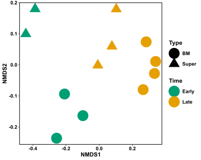
Hurrah! This figure is way easier to interpret than the base R NMDS version. I can see that there is quite a distinction in my samples based on the time of sampling (colour), and potentially also some differentiation in my samples based on the type of sample (shape). It is important to note that these distinctions don’t mean anything statistically at the moment! They are only observations. See the following link on how to calculate whether your samples are statistically different based on grouping, using an ANOSIM test.
You might also notice that I’ve only included sample information in this figure, and not the species stars that were originally present in the base R plot. Generally, I find that the species information only clutters the figure, especially when you have hundreds of species. It gives a bit of information as to what species are more commonly found in which sample, but again this isn’t statistically validated. If you want to know which species are statistically driving the differences in your samples based on your grouping of choice, try using the SIMPER test or Indicator species analysis
Lastly, you can jazz up your NMDS ordination by overlaying extra information from your data onto your plot. Here is a tutorial showing how to use the function envfit to fit environmental vectors and factors to your NMDS plot.