Alluvial plots, in the way that I’m using them here, are similar to a stacked bar plot, but look fancier and can be more aesthetically pleasing. They’re useful if you want to show how a set of variables change over time, or over a set of conditions. At each time point or category along an axis, the variables are arranged in decreasing order of value, so it’s easy to track how a variable changes with respect to the others in your data.
To make an alluvial plot, as per usual, we first need to load the required packages:
library(ggplot2)
library(ggalluvial)
library(reshape2)
Next, load your data into R as a data frame. In this case, OTUs/species are columns, samples are rows. In addition to the first column which contains the sample name, I have also added descriptor columns including “Origin”, “Day”, “Day_num”, and “Time”, preceding the OTUs/species columns. In the following code, substitute the name of your csv file for “your_data.csv”
bin = read.csv("your_data.csv", header = TRUE)
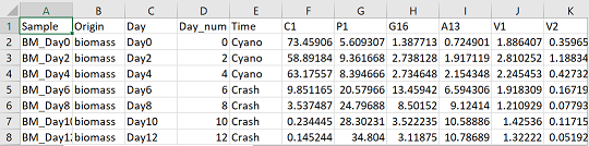
Now we need to convert the data from a “wide” format to a “long” format. The difference is explained in this tutorial. Below in the code, you will want to substitute the names of all your sample descriptor columns. Basically, all the columns that do not contain OTU/species abundance information.
bmm = melt(bin, id = c("Sample", "Origin", "Day", "Day_num", "Time"))
Choose your colours for the figure. The following colours are written in hex code, which is a way to represent colours in computer language. You can also choose from a range of colours that are built into R, but hex code will give you more flexibility. There are many colour scheme generators online that will also give you colours in hex code (i.e. https://coolors.co/app)
I have 8 species in this data, so I need 8 colours
colours = c("#418C6D", "#B11776","#F795A4", "#166BAF", "#F5D79E", "#AF794D", "#9C9CAF", "#1B1A54")
The next bit of code is a workaround to an R default. In R the levels of a variable are automatically arranged alphabetically. Thus, in this case, Day 10 would come before Day 2 alphabetically which doesn’t make chronological sense. The following code keeps the “Day” variable in the same order as the excel sheet. You can substitute all instances of “Day” in the code for all instances of any variable you want to keep in the same order as your original data.
bmm$Day <- factor(bmm$Day,levels=unique(bmm$Day))
The following code plots the alluvial figure. geom_alluvium specifies that we want to add the alluvium layer to the figure. The alluvium (plural: alluvia) is the “ribbon” that is linked across the multiple time points or conditions. In this case the alluvia will be the “variable” column, which contains the OTUs/species from the original data.
 xx = ggplot(bmm, aes( x = Day, y = value, alluvium = variable)) +
	geom_alluvium(aes(fill = variable), colour = "black", alpha = 1, decreasing = FALSE) +
	labs(x = "", y = "Percent of binned community (%)", fill = "", colour = "") +
	scale_y_continuous(expand = c(0,0), limits = c(0,100)) +
	scale_x_discrete(expand = c(0.02,0.02)) +
	theme(legend.position = "top", axis.text.y = element_text(colour = "black", size = 12, face = "bold"),
	axis.text.x = element_text(colour = "black", face = "bold", angle =90, size = 12, vjust = 0.5),
	axis.title.y = element_text(colour = "black", face = "bold", size = 14),
	panel.background = element_blank(), panel.border = element_rect(colour = "black", fill = NA, size = 1.2),
	legend.text = element_text(size = 10, face = "bold")) +
	scale_fill_manual(values = colours)

xx
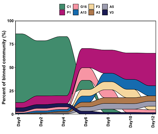
You can see clearly from this figure how the species are changing over the time series. The dominant species of Days 0-4, C1, becomes nearly non-existent by Day 10, while P1 and other species become more abundant.
Save with ggsave:
ggsave("alluvial.svg")