Scatter plots are basic plots showing the relationship between two (usually continuous) variables. Making scatter plots in R is relatively straightforward using the ggplot2 package. There are lots of more in-depth tutorials on using the ggplot2 package online. Here is one example.
Start by loading the ggplot2 library, and then loading in your data with columns as OTUs/variables, and rows as samples.
library(ggplot2)
df = read.csv("Your_OTU_table.csv", header= TRUE)
The data I’m using looks like this:
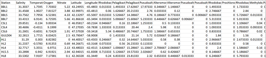
The first column is sample name, the next 4 columns contain environmental parameters for each sample (i.e. Salinity, Temperature, etc). Then, the following 2 columns contain the latitude and longitude for each sample, and the remaining columns contain the 200+ OTU abundances that correspond to each sample.
Basic Scatter plot
For my first plot, I am interested in observing the relationship between temperature and a certain species (Pelagibacteraceae.OTU_307744):
xx = ggplot(df, aes(x = Temperature, y = Pelagibacteraceae.OTU_307744)) +
    geom_point(size = 4) +
    labs(y = "Pelagibacteraceae (OTU 307744) (%)", x = "Temperature (C)") +
    theme( axis.text.x = element_text(face = "bold",colour = "black", size = 12),
        axis.text.y = element_text(face = "bold", size = 11, colour = "black"),
        axis.title= element_text(face = "bold", size = 14, colour = "black"),
        panel.background = element_blank(),
        panel.border = element_rect(fill = NA, colour = "black"))
xx
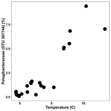
This is a pretty bare-boned plot with Temperature on the x-axis and the species abundance on the y-axis. In the code:
- ggplot specifies the data frame I’m using and the aesthetics (aes) parameter
- aes specifies how variables in the data are mapped to visual properties of the plot. aes can also be used within geoms
- geom_point specifies that I want a scatter plot
- geoms are the visual representations of observations. In other words, geoms tell ggplot how you want your data to be plotted (i.e. bar, point, line, etc).There are many different geoms.
- labs specifies the labels of my axes
- theme specifies all the parameters that contribute to the plot’s theme (i.e. text size, plot backgrounds, etc)
With ggplot2 figures, the best way to save is using ggsave:
ggsave("Your_plot_name.svg")
Adding colour
The previous plot was pretty boring, so let’s make things more interesting… One of the most advantageous things about ggplot2 is how easy it is to map extra variables to different aesthetics, like colour, shape, or size. In the plot below, I want to include information about the sample’s latitude to my plot, so I map the aesthetic colour within geom_point to latitude:
xx = ggplot(df, aes(x = Temperature, y = Pelagibacteraceae.OTU_307744)) +
    geom_point(aes(colour = Latitude), size = 4) +
    labs(y = "Pelagibacteraceae (OTU 307744) (%)", x = "Temperature (C)") +
    theme( axis.text.x = element_text(face = "bold",colour = "black", size = 12),
        axis.text.y = element_text(face = "bold", size = 11, colour = "black"),
        axis.title= element_text(face = "bold", size = 14, colour = "black"),
        panel.background = element_blank(),
        panel.border = element_rect(fill = NA, colour = "black"),
        legend.title = element_text(size =12, face = "bold", colour = "black"),
        legend.text = element_text(size = 10, face = "bold", colour = "black")) +
    scale_colour_continuous(high = "navy", low = "salmon")

xx
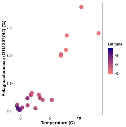
Now the plot is a bit more exciting. Samples at lower latitudes are pink in colour, while samples at higher latitudes are navy in colour.
Adding a regression
It’s obvious that there is a relationship between this species and temperature. To showcase this better, we can add a regression line using geom_smooth. Because the relationship looks linear, I’ll use method=”lm” (for linear model)
xx = ggplot(df, aes(x = Temperature, y = Pelagibacteraceae.OTU_307744)) +
    geom_smooth(method = "lm", alpha = 0.2, colour = "black") +
    geom_point(aes(colour = Latitude), size = 4) +
    labs(y = "Pelagibacteraceae (OTU 307744) (%)", x = "Temperature (C)") +
    theme( axis.text.x = element_text(face = "bold",colour = "black", size = 12),
        axis.text.y = element_text(face = "bold", size = 11, colour = "black"),
        axis.title= element_text(face = "bold", size = 14, colour = "black"),
        panel.background = element_blank(),
        panel.border = element_rect(fill = NA, colour = "black"),
        legend.title = element_text(size =12, face = "bold", colour = "black"),
        legend.text = element_text(size = 10, face = "bold", colour = "black")) +
    scale_colour_continuous(high = "navy", low = "salmon")

xx
FYI: to statistically support this relationship, perform a linear regression in R to get the R2 and p values:
lm = lm(df$Temperature~df$Pelagibacteraceae.OTU_307744)
summary(lm)
The output of this shows the relationship is highly statistically significant (Adjusted R-squared value: 0.823, p value«<0.05):
Call:
lm(formula = df$Temperature ~ df$Pelagibacteraceae.OTU_307744)

Residuals:
    Min      1Q  Median      3Q     Max
-2.2053 -0.9336 -0.5215  0.5028  3.8232

Coefficients:
                                Estimate Std. Error t value Pr(>|t|)
(Intercept)                       0.4082     0.4476   0.912    0.372
df$Pelagibacteraceae.OTU_307744   1.3008     0.1280  10.165 1.45e-09 ***
---
Signif. codes:  0 ‘***’ 0.001 ‘**’ 0.01 ‘*’ 0.05 ‘.’ 0.1 ‘ ’ 1

Residual standard error: 1.634 on 21 degrees of freedom
Multiple R-squared:  0.8311,	Adjusted R-squared:  0.823
F-statistic: 103.3 on 1 and 21 DF,  p-value: 1.454e-09
Faceting plots
Cool, now we have colour and regressions in our scatter plot, but we’re still only looking at the relationship of one environmental variable with one species. What if we wanted to cover a bit more ground, and look at this relationship over multiple species? This is where faceting comes in handy.
Below we will facet the scatter plot so that we can see the relationship between temperature and species abundance over four different species
First, I need to load in the reshape2 package for data manipulation, and then take a smaller subset of my data that includes 4 OTU columns:
library(reshape2)
otus = df[,1:11]
Now I convert my “wide” format data into “long” format, while specifying all columns I want to keep separate (all columns that are not OTUs)
otus_melt = melt(otus, id = c("Station", "Salinity", "Temperature", "Oxygen", "Nitrate", "Latitude", "Longitude"))
Now my data is in the right format, and I can plot it in ggplot2 using the facet_wrap parameter.
xx = ggplot(otus_melt, aes(x = Temperature, y = value)) +
    facet_wrap(.~variable, scales = "free_y") +
    geom_smooth(method = "lm", alpha = 0.2, colour = "black") +
    geom_point(aes(colour = Latitude), size = 4) +
    labs(y = "Relative Abundance (%)", x = "Temperature (C)") +
    theme( axis.text.x = element_text(face = "bold",colour = "black", size = 12),
        axis.text.y = element_text(face = "bold", size = 10, colour = "black"),
        axis.title= element_text(face = "bold", size = 14, colour = "black"),
        panel.background = element_blank(),
        panel.border = element_rect(fill = NA, colour = "black"),
        legend.title = element_text(size =12, face = "bold", colour = "black"),
        legend.text = element_text(size = 10, face = "bold", colour = "black"),
        legend.position = "top", strip.background = element_rect(fill = "grey90", colour = "black"),
        strip.text = element_text(size = 9, face = "bold")) +
    scale_colour_continuous(high = "navy", low = "salmon")
xx
Now we can see the relationship of temperature vs abundance for four different OTUs. I’ve specified scales = “free_y” because my abundance ranges vary considerably across these four species.
Pairwise scatter plots
I will now introduce pairwise scatter plots, a visualization strategy I brought up in the Mantel test tutorial. The point of this figure will be to visualize the correlation between two corresponding matrices of data. Each point in these pairwise scatter plots will represent the difference between two samples (rather than the value for one sample as was the case in the previous plots).
Briefly, I first generate the dissimilarity matrices from the Mantel test tutorial. One for community abundance, one for temperature, and one for physical separation.
abund = df[,8:ncol(df)]
temp = df$Temperature
geo = data.frame(df$Longitude, df$Latitude)


#distances
#abundance - Bray Curtis
dist.abund = vegdist(abund, method = "bray")

#temperature - Euclidean
dist.temp = dist(temp, method = "euclidean")

#geographic distance - Haversine
d.geo = distm(geo, fun = distHaversine)
dist.geo = as.dist(d.geo)
Next, I need to convert these distance matrices (multiple columns) into vectors (one column), and then combine these matrices into one new data frame mat
aa = as.vector(dist.abund)
tt = as.vector(dist.temp)
gg = as.vector(dist.geo)

#new data frame with vectorized distance matrices
mat = data.frame(aa,tt,gg)
Now I’m ready to plot my data. First is the pairwise comparison of community dissimilarity and differences in temperature:
#abundance vs temperature
mm = ggplot(mat, aes(y = aa, x = tt)) +
    geom_point(size = 3, alpha = 0.5) +
    labs(x = "Difference in Temperature (C)", y = "Bray-Curtis Dissimilarity") +
    theme( axis.text.x = element_text(face = "bold",colour = "black", size = 12),
        axis.text.y = element_text(face = "bold", size = 11, colour = "black"),
        axis.title= element_text(face = "bold", size = 14, colour = "black"),
        panel.background = element_blank(),
        panel.border = element_rect(fill = NA, colour = "black"))
mm
In this figure, difference in temperature is along the x axis, while community dissimilarity increases along the y-axis. It’s clear that as the difference in temperature between two samples (one pairwise point) increases, so too does the dissimilarity in microbial community structure. This matches the high statistically significant correlation identified in the Mantel test.
Next we plot community dissimilarity and physical separation of samples.
#abundance vs geographic distance
mm = ggplot(mat, aes(y = aa, x = gg/1000)) +
    geom_point(size = 3, alpha = 0.5) +
    labs(x = "Physical separation (km)", y = "Bray-Curtis Dissimilarity") +
    theme( axis.text.x = element_text(face = "bold",colour = "black", size = 12),
        axis.text.y = element_text(face = "bold", size = 11, colour = "black"),
        axis.title= element_text(face = "bold", size = 14, colour = "black"),
        panel.background = element_blank(),
        panel.border = element_rect(fill = NA, colour = "black"))
mm
Here there doesn’t seem to be much of a relationship between how far apart samples are and how different their microbial communities are. This too matches the non-significant result from the Mantel test.
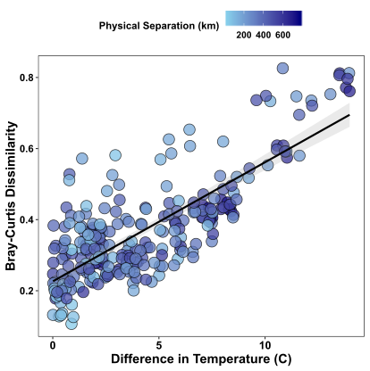
Finally, we can also add colour and regression lines to pairwise plots. Here I’m plotting again the the pairwise comparison of community dissimilarity and differences in temperature, and I’m overlaying the geographic distance separating the samples in colour. I’ve also included my cheat to get points that have filled in colour and are outlined in black, using shape=21 and colour=”black” in the geom_point parameter.
mm = ggplot(mat, aes(y = aa, x = tt)) +
    geom_point(size = 4, alpha = 0.75, colour = "black",shape = 21, aes(fill = gg/1000)) +
    geom_smooth(method = "lm", colour = "black", alpha = 0.2) +
    labs(x = "Difference in Temperature (C)", y = "Bray-Curtis Dissimilarity", fill = "Physical Separation (km)") +
    theme( axis.text.x = element_text(face = "bold",colour = "black", size = 12),
           axis.text.y = element_text(face = "bold", size = 11, colour = "black"),
           axis.title= element_text(face = "bold", size = 14, colour = "black"),
           panel.background = element_blank(),
           panel.border = element_rect(fill = NA, colour = "black"),
           legend.position = "top",
           legend.text = element_text(size = 10, face = "bold"),
           legend.title = element_text(size = 11, face = "bold")) +
    scale_fill_continuous(high = "navy", low = "skyblue")

mm