Contour plots are used to show 3-dimensional data on a 2-dimensional surface. The most common example of a contour plot is a topographical map, which shows latitude and longitude on the y and x axis, and elevation overlaid with contours. Colours can also be used on the map surface to further highlight the contours. Contour plots can be useful in a variety of situations and are powerful tools for visualizing 3 continuous variables. Usually, the x and y variables are continuous predictor variables, and the 3rd contour variable (or Z variable) is dependent on the first two.
Examples of situations when contour plots are appropriate:
- Maps:
- x: longitude, y: latitude, z: elevation
- Oceanography:
- x: time/distance/etc, y: depth, z: temperature/salinity/nutrient/etc
- Biology:
- x: longitude, y: latitude, z: species abundance
- Modeling:
- x: parameter1, y: parameter2, z: parameter 3
In the following case, I am using a modeling example where I want to show the predictions of a model based on two of the predictor variables. In this case, we have a certain equation/model (the specifics aren’t important here) that gives productivity (z variable) as a function of light intensity (x variable) and biomass concentration (y variable). Here, I am using the contour plot to show the productivity (z variable) that can be expected over a range of light intensities (x variable) and biomass concentrations (y variable).
To make the contour plot we have to first load the required packages:
#load required R libraries

library(ggplot2)
library(reshape2)
library(metR)
ggplot2 is used for plotting the underlying coloured surface, reshape2 is used for manipulating the data, and metR is an extension to ggplot2 that adds the contour lines and labels.
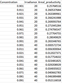
Next you have to read in your data. Ideally your data will be in the “long” format already, where you will only have one column for each of your three variables (x, y, and z). See below:
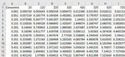
However, you may have it in the “wide” format as in the following matrix, with your row names as your x variables, your column names as your y variables (or vice versa), and the cells in between containing the values in your z variable. See below:
Either way, start by loading in your data table:
con = read.csv("Data_table.csv", header = TRUE)
If your data is already in the “long” format. Lucky you! Skip the next two blocks of code and go straight to making your contour plot. If your data is in the “wide” format, you’ll need to convert it to the long format:
conm = melt(con, id = "Biomass")
In the above code, my first column “Biomass” remains (change this to match the name of the first column of your data set), while all other columns will be converted into a single column (termed “variable”), and all the corresponding values will be placed in a “value” column.
R doesn’t like that I loaded in a dataset that contained column names beginning with numbers and it automatically adds an “X” character to the start of any column names it deems inappropriate (like those beginning with numbers). The code below deletes the “X” character and then tells R that the new “variable” column is numeric (it contains numbers rather than characters).
conm$variable <- gsub("X", "", conm$variable)
conm$variable = as.numeric(conm$variable)
Now finally, the data is in the appropriate format for plotting a contour plot. The code is a bit long and complicated, see below for explanations on each parameter.
gg = ggplot(conm, aes(x = variable, y = Biomass)) +
  geom_raster(aes(fill = value)) +
  geom_contour(aes(z = value), colour = "white", size = 0.2, alpha = 0.5) +
  geom_text_contour(aes(z = value),  colour = "white" ) +
  labs(x = "Filtered light intensity (umol photons/m2/s)",
      y = "Dry Biomass Concentration (g/L)",
      fill = "Productivity (umol O2/g biomass/s)") +
  theme(legend.title = element_text(size = 10, face = "bold"),
  legend.position = "top", panel.background = element_blank(),
  axis.text = element_text(colour = "black", size = 10, face = "bold"),
  axis.title = element_text(size = 12, face = "bold"),
  legend.text = element_text(size = 11), legend.key = element_blank()) +
  scale_fill_continuous(low = "#BFE1B0", high = "#137177") +
  scale_y_continuous(expand = c(0,0)) +
  scale_x_continuous(expand = c(0,0))

gg
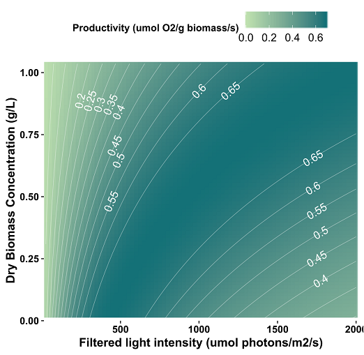
Contour plot code breakdown:
- gg = ggplot(conm, aes(x = variable, y = Biomass)) : assigns plot to object gg and assigns x and y variables
- geom_raster(aes(fill = value)) : creates underlying coloured surface which is filled according to the z variable (“value” in this case)
- geom_contour(aes(z = value), colour = “white”, size = 0.2, alpha = 0.5) : adds white contour lines to the plot based on the z variable
- geom_text_contour(aes(z = value), colour = “white” ) : labels contour lines with the corresponding numeric values
- labs(x = “Filtered light intensity, …) : provides labels for axes and legends
- theme(legend.title = element_text…) : provides specific details on the aesthetics of the plot (font sizes, background colours etc)
- scale_fill_continuous(low = “#BFE1B0”, high = “#137177”) : gives the colours of the fill parameter in hex code. See more r colour options here.
- scale_y(x)_continuous(expand = c(0,0)) : prevents the plot from expanding beyond the limits of the y/x axis